Down And Nerdy Podcast

Down And Nerdy Podcast
Go to the Down And Nerdy Podcast website

Wednesday, October 14, 2015

Review - GI Joe: Cobra World Order Prelude

GI Joe: Cobra World Order Prelude
IDW Publishing
Written by Larry Hama
Art by S L Gallant
Inks by Brian Shearer
Colors by J. Brown
Letters by Shawn Lee
 
Welcome to the world of G.I. Joe!  Wait...aren't we over 200 issues in?  In this Cobra World Order Prelude from IDW, you get a grand tour of the new Joe base and somewhat of a recap of what's been going on.  This is not a reboot, but certainly feels like an issue that familiarizes readers with the world of the Joes and Cobra from the characters to the plotlines.  In case you're wondering, yes there is a reason for it.
 
A new Senator has been named to the oversight committee, and has brought her assistant along to inspect the new Pit.  Not surprising, there is something very suspicious about one of the visitors that prompts action from the team.  The word "action" is used loosely, but the clever nature of the rouse makes you appreciate it.  Duke may be good at pulling the wool over the eyes of the enemy, but should probably save the jokes for those more qualified.
 
This is definitely an issue where a new reader could jump in and be ready for the Cobra World Order arc when it starts.  Much like the Joes themselves, I like that IDW has kept the team of Hama and Gallant together going forward with this new arc.  The art is very consistently good, and the dialogue written for each character definitely captures what made the original animated series great.  Being a prelude, it's hard to get a grasp on where the story is going from here or what to expect going forward.  There is a hint at possible relationships between several different terror groups, but nothing too definitive.  Even though the title is Cobra World Order, something tells me they won't be the only focal point of the arc going forward.  If you have enjoyed the G.I. Joe comics up until this point, you'll definitely be keeping this in your pull.  If you're a new reader, this may be the issue where you can jump in and give the series a shot.
 
RATING: Pick Up 

Wednesday, October 7, 2015

Review - Batman & Robin Eternal #1

Batman & Robin Eternal #1
DC Comics 
Story by Scott Snyder & James Tynion IV
Script by James Tynion IV
Pencils by Tony Daniel
Inks by Sandu Florea
Colors by Tomeu Morey
Letters by Tom Napolitano
 
No way that just happened!  That's what I kept saying as I read Batman & Robin Eternal #1.  Right in the first few pages, you understand why they added Robin to this second Eternal story.  Every Robin (aside from Carrie Kelly for obvious reasons) was seen or referenced in this first issue.  Dick Grayson is featured prominently, and it looks like he will be the main focus of this series right now.  Yes, this does follow the current DC Comics continuity from Grayson, the main Batman run and so on.   Fans of  characters like Bluebird and the new Batman will not be disappointed either.  Bruce Wayne, however, still has a major part in this debut issue.
 
One of the things I loved about this were the flashbacks to when Dick was Robin, but little did I know, those flashbacks would serve a purpose going forward.  It's so hard to give you a plot without giving any spoilers.  Let's just say we have a new villain, everyone is going to be involved and something UNTHINKABLE has happened.  It's another daring trip into the Batman mythology by Scott Snyder, and having James Tynion IV riding shotgun makes it a wild ride I can't wait to take.
 
The art, top to bottom, is very consistent.  The last panel if this comic is something that EVERYONE will be talking about.  Tony Daniel, and many others I'm sure, will be doing commissions on this for a LONG time.  That panel, along with the story leading up to it, is a huge game changer.  In the beginning of the issue you may think, "They're really doing this again?"  I promise you, by the end, you will be saying, "I can't believe that just happened!"  I cannot buy this series fast enough.
 
RATING: PULL/BUY


Wednesday, September 30, 2015

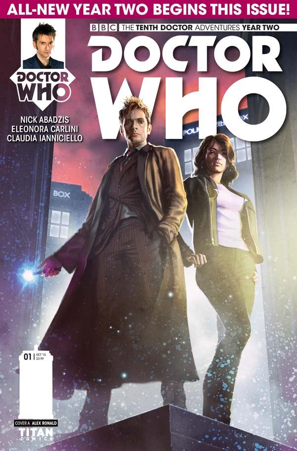
Review - Doctor Who: The Tenth Doctor #2.1

DOCTOR WHO: TENTH DOCTOR #2.1
Titan Comics
Written by Nick Abadzis
Art by Eleonora Carlini
Colors by Claudia SG Iannicello
Letters by Richard Starkings & Jimmy Betancourt

The adventure continues for The Doctor and Gabby in the aftermath of the Four Doctors event.  Just when they thought they were going to get a break, the pair find themselves in a place called Wupatki.  The city in the clouds is plagued by a virus that is affecting living musical beings called the Shan'Tee.

There is a lot of setup in the beginning of the issue.  A lot of explanation about what the Shan'Tee are and how the planet lives in harmony.  Once you push through that, things start to escalate rather quickly.  The cause for this virus is somewhat amusing, and may even be a subtle jab at the modern music business.  There was also a little jab about the Wupatki being a place where humans were able to live in harmony with the planet's natives instead of forcing them out.  Sound familiar?

This truly ends up being a "race against time" kind of story, with a climactic pause at the end of this first issue.  This being a two part arc, it almost reminds me of the old Adam West Batman show.  Part one ends in potential disaster with part two being the "epic conclusion".  The art by Carlini won't knock your Tardis over, but it works and has some good detail.  The story was interesting, but it feels like it went from one extreme to another, and I didn't get that sense of danger I was hoping for.  Whovians may be inclined to stick with it, but I will reluctantly have to pass.

RATING:  DROP

Wednesday, September 23, 2015

Review - Colder: Toss The Bones #1

Colder: Toss The Bones #1
Dark Horse Comics 
Written by Paul Tobin
Art by Juan Ferreyra
Colors Assisted by Eduardo Ferreyra
Letters by Nate Piekos
 
Dark Horse is no stranger to the strange, and that certainly doesn't change in the start of this third volume in the Colder series.  For readers who aren't familiar, the series follows a character named Declan who has been on quite the mental roller coaster ride in the first couple of volumes.  This twisted tale of insanity, between Boston and the Hungry World, does bring back a familiar foe for previous readers, and that's Nimble Jack.
 
Nimble Jack strikes me as a more goth and mysterious version of The Joker.  It's almost how I would imagine Johnny Depp portraying The Joker.  As someone who didn't read a lot of the previous series, I didn't find it hard to pick up on what was going on.  We see Declan and Reece trying to deal with the aftermath of their battle with Swivel, but this issue centers more around Nimble Jack and his plan to regroup.  Problem is...I'm not sure we really get there.  It's truly like watching a psychopath with ADHD go from sadistic idea to idea, before finally saying the hell with it.
 
I'm not saying that's a bad thing.  I actually think the way Tobin weaves Jack's frantic mind is quite admirable.  Tobin's use of hunger as a metaphor on both worlds is also nothing short of brilliant.  One thing I will say is the art is very striking.  Even the subtle details from Juan Ferreyra fly off the page like a runaway pigeon (if you read it, you'll know what I mean there.)  The shift in colors between worlds by the other Ferreyra.  So visually, it's definitely worth the price of admission.  I'm not saying I don't like the writing.  What I'm saying is, it might be hard for new readers to jump right in with an appreciation of these characters right away and where the story is going.  It definitely makes you feel uneasy, and it's supposed to.  If you're a fan of creepy horror, led by a truly mad antagonist, you'll enjoy this.
 
Rating: PICK UP  

Wednesday, September 16, 2015

Review - Tet #1

Tet #1 - IDW Publishing
Written by Paul Allor
Art by Paul Tucker
Letters by Paul Allor
 
The Vietnam is always an uneasy subject.  It's one of controversy, and in a way, changed our world as we know it.  As we dive into that world, that is exactly what happens to the main character, Eugene.  The narrative is hesitant and emotional, as we travel back to Vietnam in 1968.  In the midst of a war he thinks will be ending, Eugene thinks he may have made a life for himself and his new Vietnamese fiancee (this is how they spell it within the comic.)  Then things take an ugly turn when something happens to Eugene's friend Chip.
 
Unfortunately, this is where the book take a bit of a turn.  I was enjoying the hopeful, and yet heartbreaking, narrative that Paul Allor was creating.  When the plot twist happens, it almost comes with a bit of disappointment.  I'm not saying it won't be interesting going forward, but the story of an American solider in the middle of the Vietnam War during Tet trying to find his way home with a new woman in his life, seemed to spark my interest more.  We even see this twist change Eugene's character, which definitely made him less likable.
 
The art by Tucker seems to be appropriate, given the time period and the setting.  Still, it fell a bit short for me.  There was one panel, which was a close-up on Eugene's fiancee Ha, that was stunning.  The rest seemed, more often than not, emotionless.  I actually got more emotion from the shaky lettering style (yes, that's a compliment) of the book than the art itself.  If you're a history buff, or a fan of war stories, this probably isn't the book for you.  I will say, that if we see a turn back to more of the story about the soldier's personal story, I would definitely be more interested in this book.  My worry is, that is not the overall direction this will be going.
 
Rating: DROP

Wednesday, September 9, 2015

Review - Tyson Hesse's Diesel #1


Tyson Hesse's Diesel #1
Boom Studios

Written by Tyson Hesse
Art by Tyson Hesse
Colors by Mariel Cartwright
Letters by Jim Campbell

Some people have their head in the clouds.  That is literally, and figuratively, the case for Dee Diesel in this new limited series from Boom Studios.  She is the last of her family line, living in a floating city above the clouds called Peacetowne.  Quickly we find out this is your classic "she's too young to be any good at anything" stories that we tend to see in a lot of animated movies and TV shows...or is it?  There really are a couple of views that readers could take in this story.

Yes Dee is young, and completely full of energy.  The way I see it, you're either going to love Dee for her youthful exuberance or be completely 100% annoyed by her constantly.  For the captain of the ship, it is definitely the latter.  I found Dee mostly charming, and actually reminded me a lot of Vanellope Von Schweetz from Wreck-It Ralph.  She just wants to be great, and she wants people to know it.  Then the issue takes a dramatic turn from her antics to a threat that could destroy the entire floating city.  What happens next may literally drive the course of the remaining issues, we just don't know how yet.

For Tyson Hesse to tackle both the writing and the art in this series was very impressive.  Neither element really suffered, as the humorous dialogue mixed well with the Dragon Ball style art.  I definitely got a good laugh at the titles of a couple of the captain's books and thought Rickets added even more charm and gave Dee someone to talk to.  Much like how Dee is trying to live up to her father, this book has to live up to a lot of the Disney-like storytelling that it seems to be embarking on.  Call me cautiously optimistic that it works out for the better.

Rating: PICK UP 

Wednesday, September 2, 2015

Review - Plutona #1

(Cover image via imagecomics.com)

Plutona #1 - Image Comics
Written by Jeff Lemire & Emi Lenox
Art by Emi Lenox
Colors by Jordie Bellair
Letters by Steve Wands
When you're looking for a story that's relatable, character driven and real...you turn to Jeff Lemire.  His ability to make you care about his characters never ceases to amaze me, and Plutona is no exception.  In this story we follow a group of students, who I can only assume are in Middle School, as they go about what they think will be a normal day in a world filled with superheroes.  As is often the case, that is about to take a very real and nasty turn.
When the book starts out, and we meet each character, one of the main things that jumps out to me is how busy the parents are in each case.  All kids crave attention from their parents, and each other, but this common bond is what really make these character interactions work and shape each one of them.  Ray comes from a more abusive household, which clearly makes him the jerk of the group.  Mie is your typical annoyed older sister, forced to look after her brother.  Then there's Teddy, who seems to be the dreamer of the group.
As you read through this book, each one of these kids brings something to the table.  The art by Emi Lenox is the perfect pair, and really helps drive the story without a single word on the page.  Superheroes are the celebrities here, which is a tone we have seen before in some movies and/or books.  What makes this different is the shocking first few panels and the conclusion that follows.  This book is NOT what you will expect, and that is a good thing.  Lemire continues to be one of the most consistent writers in the business, and Lenox clearly shows the potential to be a huge star going forward.  Where do we go from here?  You'll want to find out.
RATING: PULL